How to Generate a Complete Design System with Moonchild AI (Step-by-Step)
Updated February 13, 2026
How to Generate a Complete Design System with Moonchild AI (Step-by-Step)
Design systems are the invisible infrastructure behind every consistent product. They determine whether your screens feel like they belong to the same product or look like they were designed by five different people on five different days. Building one properly has traditionally taken months. Moonchild AI changes the timeline without cutting corners on what matters.
This tutorial walks through the complete process, from creating a new design system to using it across your projects and exporting it to other tools.
Before You Start: Preparing Your Design System Assets
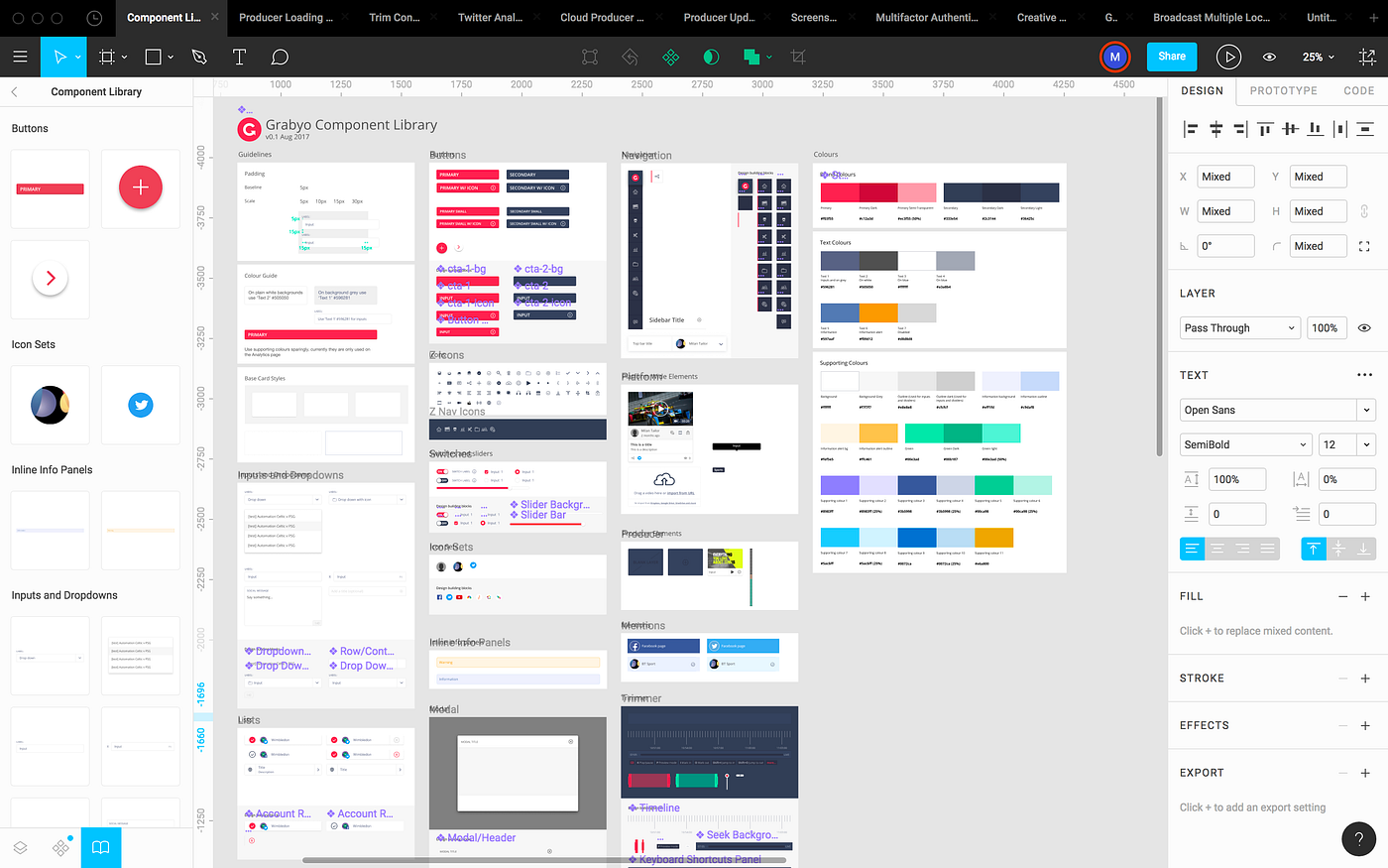
If you already have a design system, you can upload it to the DS editor in three formats: HTML, Figma SVG, and PNG. Moonchild AI responds best to HTML and then Figma SVGs — these formats preserve structure, token names, and component hierarchy in ways that give the AI much more to work with. PNGs work but are essentially visual references, so the AI has to interpret rather than parse.
If you have the option, exporting your components as HTML or copying Figma frames as SVGs will make the entire process significantly smoother. The AI can read your actual spacing values, color tokens, and typography specs directly from structured formats instead of guessing from a screenshot. It's worth the extra step of optimizing your exports before you begin.
Getting Started: Two Paths
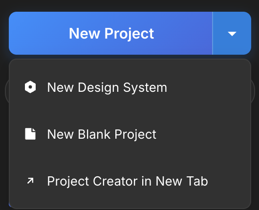
To create a design system in Moonchild, click the New Project dropdown and select New Design System.
This brings you to the design system setup page, where you're immediately presented with two options.
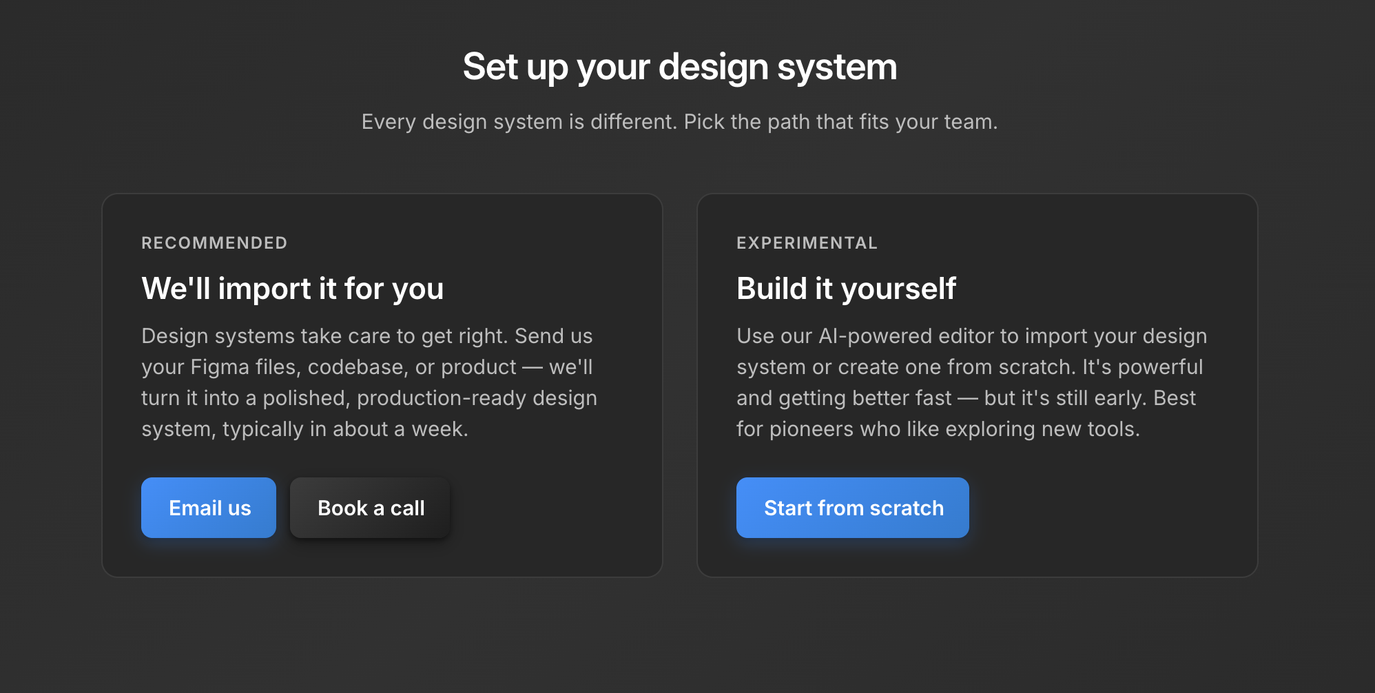
Path 1: "We'll import it for you" (Recommended) — The Moonchild team gets on a call with you, typically within a day, to understand your existing design system. Whether your source of truth lives in Figma, Storybook, or directly in code, the team reviews it with you and sets up a polished, production-ready design system inside Moonchild. This is the recommended path for teams that already have a system and want it imported correctly without guessing.
Path 2: "Build it yourself" — You use Moonchild's AI-powered DS editor to create a system from scratch or describe your existing one conversationally. This path is more hands-on and works well for teams starting fresh or designers who enjoy building systems iteratively.
Both paths lead to the same place: a complete, structured design system that works across all your Moonchild projects.
Building It Yourself: The DS Editor
If you choose the self-guided path, you'll first be asked to name your design system. Pick something meaningful — "Untitled Design System" won't help your team six months from now. Name it after your product or brand.
After saving the name, you're brought into the DS editor. On the left side is the DS chat — this is where you'll spend most of your time. On the right is the system itself, organized into clear sections.
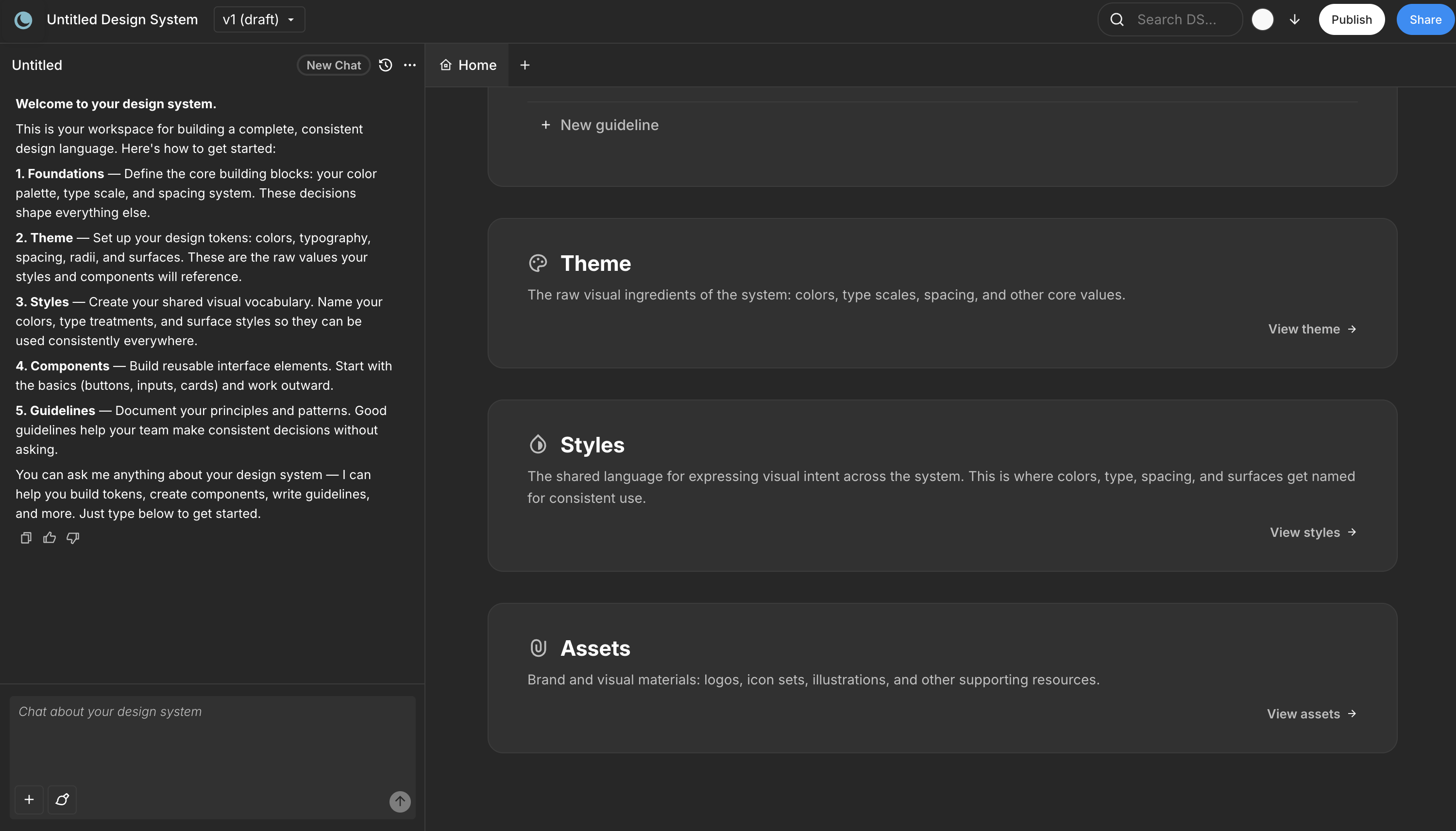
The chat is conversational. You explain your product, your brand, your constraints, and Moonchild guides you through supplying all the information it needs to build out a first draft. Think of it as a design systems consultant that asks the right questions and builds as you answer.
You might start by describing your product: "We're building a fintech dashboard for small business owners. Clean, professional, high data density. Our brand color is a deep navy and we use Inter for everything." The chat will ask follow-up questions, suggest directions, and start assembling the system as you go.
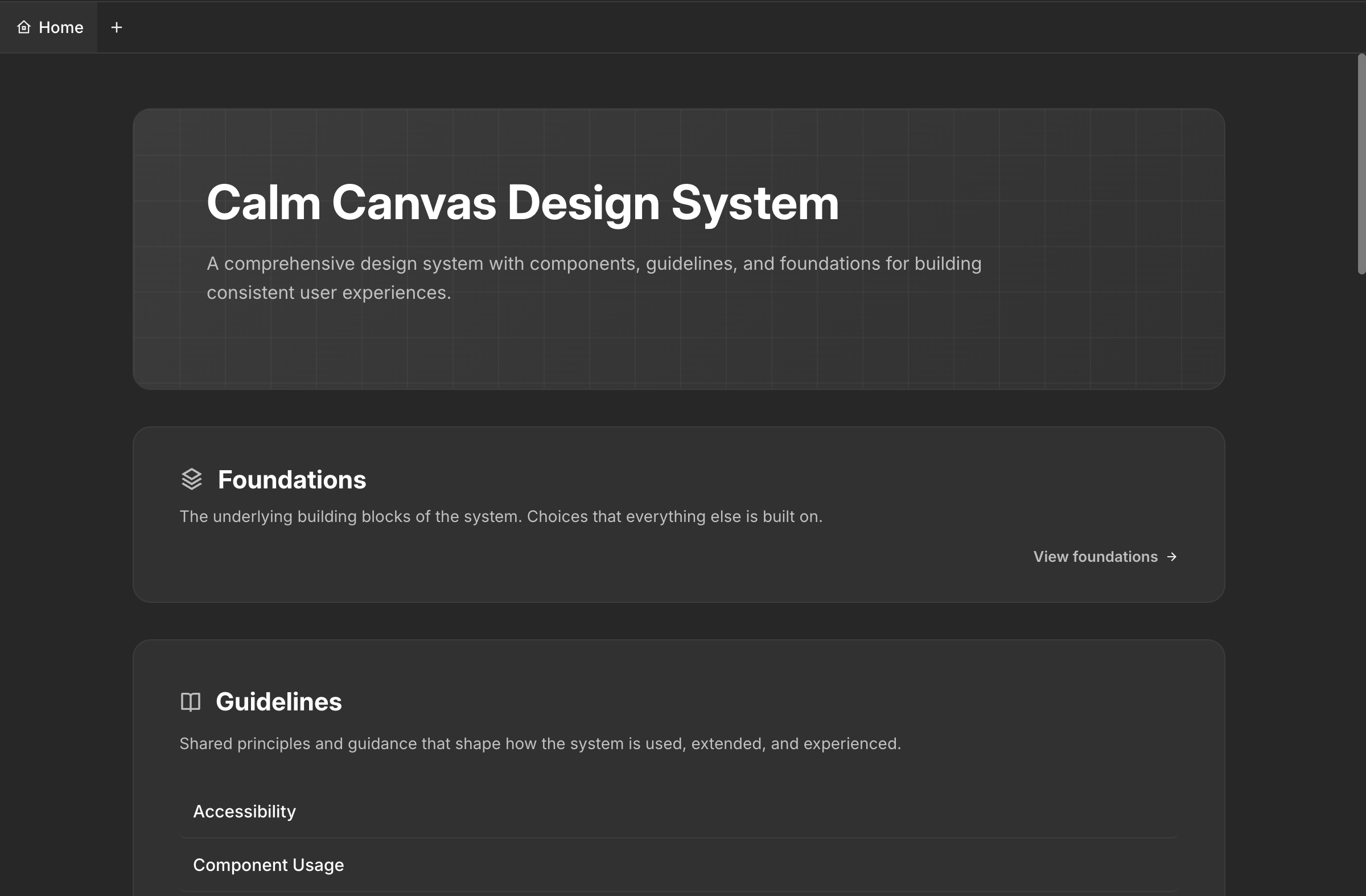
What the Design System Includes
A complete Moonchild design system is organized into seven sections, each serving a specific role:
Foundations — This is where your icon pack selection and all font selections live. Moonchild supports standard web fonts and Google Fonts, and you can also bring in custom fonts in WOFF format. If your brand uses a proprietary typeface, it works here. The foundations also include your base spacing scale and grid system.
Guidelines — These are the rules that govern how screens and components get composed. Guidelines cover types of screens (dashboards, forms, settings pages), types of components (when to use a modal vs a drawer, when to use a dropdown vs radio buttons), DOs and DON'Ts, and composition principles. This is what makes the difference between a collection of components and an actual system. When Moonchild generates screens using your DS, it follows these guidelines.
Themes — Color palettes, type scales, spacing values, and core design tokens live here. This is the raw material — the actual hex codes, pixel values, and scale ratios that everything else references. Moonchild generates a default light or dark mode depending on your DS specs, but you can ask the chat to set up a custom mode that's specific to your product as well. If your app has a "focus mode" with reduced contrast or a "dark trading" theme, you can build that.
Styles — This is where themes get named for consistent use. Instead of referencing #1A2B4C directly, your team references primary-600 or surface-elevated. Styles create the shared vocabulary between design and development.
Components — All your components live here. Buttons, inputs, cards, navigation, modals, tables — each with variants and states. Every component references the tokens defined in your themes and follows the rules set in your guidelines.
Gallery — A visual component showcase that displays everything in context. Instead of reviewing components in isolation, the gallery shows how they look assembled into realistic layouts. This makes it easy to evaluate whether the system feels cohesive before you start designing with it.
Assets — All brand assets like logos, favicons, and brand marks live here. Having these centralized means every project that uses the DS has access to the correct, current versions.
The Iterative Process
Here's something important to understand: building a design system in Moonchild is iterative, just like building one in Figma or Storybook. Your DS in Figma wasn't built in a day, and neither is this one.
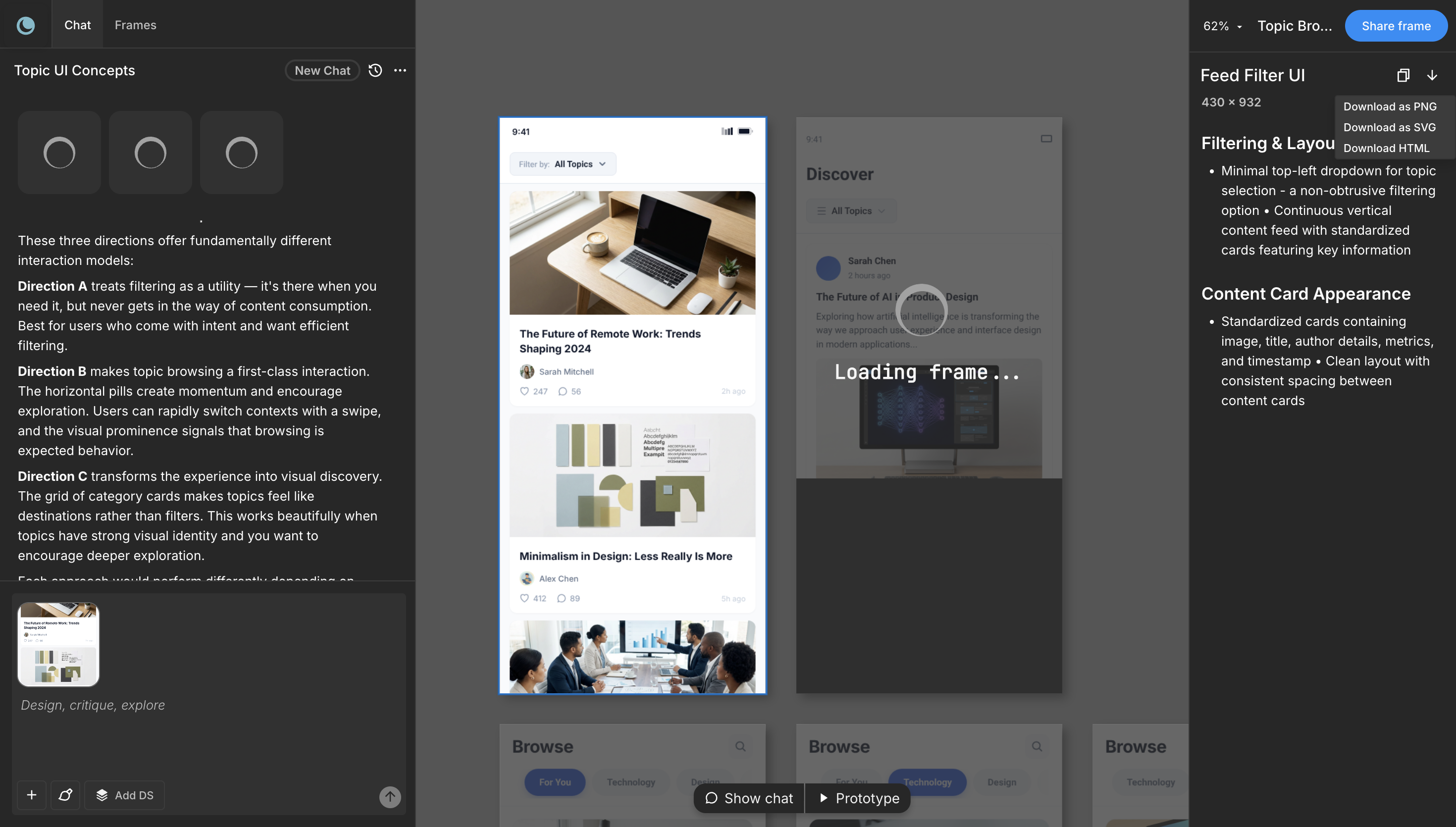
About 80% of your time is spent in the chat, refining and iterating. You might generate a first draft of your color system, review it, decide the secondary palette needs more warmth, adjust it, then move on to typography. You come back to colors after seeing them in component context and make another adjustment. This back-and-forth is normal and expected.
The chat remembers your context throughout the session. You can say "make the button border radius match what we discussed for cards" and it knows what you mean. You can ask it to show you how a specific component looks with the current tokens, or request variations on a theme.
When you've reached a good stopping point, click Publish to save and publish your design system.
Version Control
Moonchild DS has built-in version control. Every time you publish, it creates a new version. You can go back to any previous version of your design system at any time. This means you can experiment freely — if a round of changes doesn't work out, roll back to the last version that did.
This is especially valuable for teams. A designer can try a new direction for the color system, publish it as a draft, get feedback, and either keep it or revert. No risk of losing work.
Using the Design System in Projects
This is where the system proves its value. You can use your DS in any Moonchild AI project.
When creating or working on a project, click the Add DS button and select your design system. From that point on, all your new UI screens, user flows, and prototypes will use the selected design system. Every button is your button. Every color comes from your palette. Every heading uses your type scale. The consistency is immediate and it's genuinely impressive to witness.
Instead of generating generic screens and then spending hours restyling them to match your brand, you get screens that already look like your product from the first generation. A dashboard screen uses your data table component, your card styles, your color tokens. A settings page follows your form patterns and spacing rules.
This is where AI generation becomes genuinely useful for product teams rather than just a novelty. The design system acts as a constraint layer that ensures everything generated is on-brand and consistent.
Taking Your DS Beyond Moonchild
If you work with other AI tools or development environments alongside Moonchild, you can download your entire design system using the download button next to the Publish button.
The exported DS package includes all your tokens, component specs, and documentation in formats that other tools can consume. You can take it to Claude Code for full-stack implementation, Lovable for rapid MVP building, Codex for AI-assisted development, Cursor for code-first workflows, or any other tool in your stack.
This portability means your design system isn't locked into Moonchild. It's a source of truth that travels with your team, regardless of which tools you use downstream.
Tips for Better Results
Be specific early. "A healthcare platform" gives you a generic system. "A patient engagement platform that emphasizes trust and clarity for people aged 55 to 85, with high contrast requirements and large touch targets" gives you something you can actually use.
Spend time on guidelines. The foundations and themes are important, but guidelines are what make the system smart. Well-written guidelines about when to use modals vs drawers, or how to handle error states, make every screen generated with the DS significantly better.
Iterate in context. Don't just review tokens in isolation. Generate a few screens using the DS and see how everything comes together. You'll catch issues in context that you'd miss looking at a color palette by itself.
Use custom modes when relevant. The default light/dark modes work for most products, but if your product has specific contexts (a presentation mode, a data-dense mode, a simplified mobile mode), set those up as custom modes in the chat.
Publish often. Version control means there's no risk. Publish after every meaningful session so you have a snapshot to return to.
From Setup to Living System
The design system you build in Moonchild is not a static artifact. It evolves with your product. As your brand evolves, update the tokens and publish a new version. As you discover new component needs, add them. As your team grows, the guidelines help new designers make consistent decisions without constant oversight.
The teams that get the most value from Moonchild's DS treat it the same way they'd treat any design system — as infrastructure that compounds in value over time. The difference is that the initial setup takes days instead of months, and iteration happens in conversation instead of manual file editing.
Start by picking a path. If you have an existing system, let the Moonchild team import it for you. If you're starting fresh, open the editor and start describing what you're building. Either way, you'll have a working, usable design system faster than you thought possible.
Try Moonchild
Want this for your team?
Bring your design system into Moonchild and let PMs, designers, and engineers ship on-brand UI together — without breaking consistency.
Written by
Steven SchkolneFounder of Moonchild AI. Building the AI-native platform for product design.
Related Articles
AI Design Systems: The Complete Guide for Product Teams
Discover why design systems are inseparable from AI generation. Learn the four maturity levels of design systems and how to build one that works with AI tools to eliminate manual cleanup.
How Product Teams Use Moonchild AI for Rapid Prototyping
Learn how product teams use Moonchild AI to go from PRDs to interactive prototypes in minutes. A step-by-step guide covering generation, iteration, design system integration, and developer handoff.
From AI Design to Code: Using Moonchild AI with Claude Code, Lovable, and Cursor
The complete guide to taking Moonchild AI designs and shipping them as real code using Claude Code, Lovable, Cursor, and Bolt. How the downloadable design system makes every dev tool work better.