How to Create a Design System That Powers AI-Generated UI
Many teams experimenting with AI-generated UI discover a common problem: generated screens often need significant adjustment before they match the team's design system.
Typical issues include:
- Colors that do not match existing tokens
- Spacing values that fall outside the design grid
- Components that resemble existing patterns but do not match official variants
In these workflows, teams generate screens first and reconcile them with the design system afterward.
Moonchild takes a different approach. Instead of treating the design system as something applied after generation, it allows teams to provide their system as an input to the generation process.
When tokens, components, and layout patterns are defined first, they can guide how new screens are produced.
Why design systems help guide AI generation
Design systems traditionally serve as documentation and reference for human designers.
In AI-assisted workflows, they can also function as constraints that shape how interfaces are generated.
When generation is guided by a structured system, the AI can draw from:
- Defined color tokens
- Established typography scales
- Approved components
- Consistent spacing rules
This approach helps generated interfaces remain aligned with the product's visual language.
Without these constraints, generation systems may choose from a much wider range of design possibilities, which can increase the amount of refinement required afterward.
Setting up a design system for AI generation
Step 1: Formalize your system
Teams typically start from one of two situations:
Existing system — Some teams already maintain a design system in tools like Figma, including design tokens, component libraries, and documentation. In this case, the system can be imported into Moonchild.
No formal system — Other teams have consistent UI screens but no documented system. In these situations, Moonchild can help analyze existing screens and organize their patterns into tokens and components.
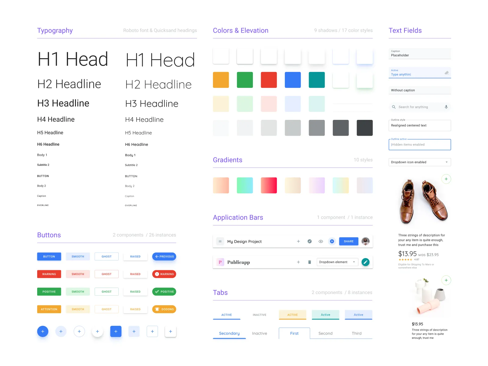
Core elements of a generation-ready system
A system used for AI-guided generation usually includes several foundational elements.
Color tokens
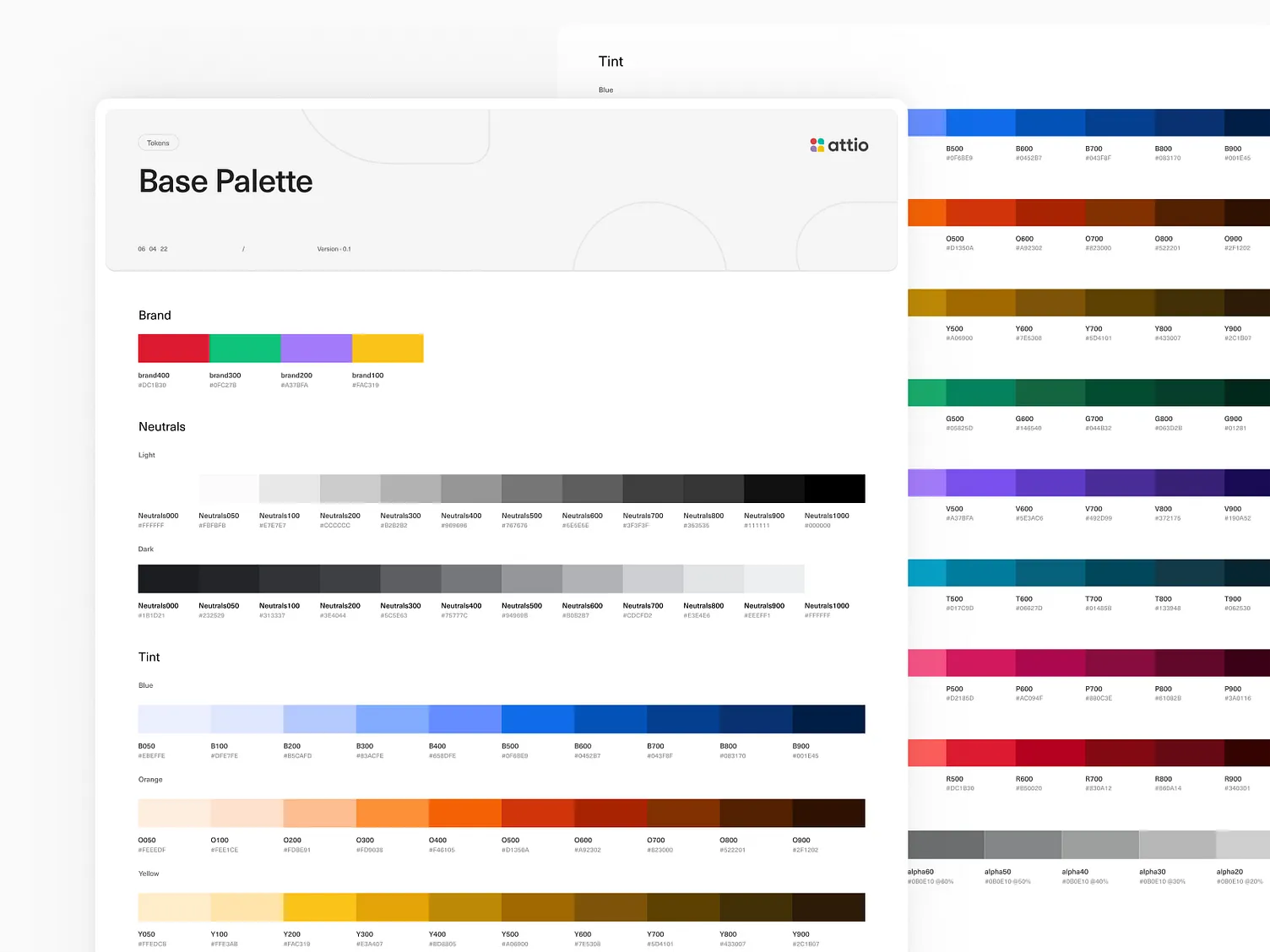
Instead of scattered color values, tokens provide semantic structure. Examples include primary palette, secondary palette, neutral colors for text and backgrounds, and status colors such as success, warning, or error. These tokens allow designers and developers to apply colors consistently across screens.
Typography tokens
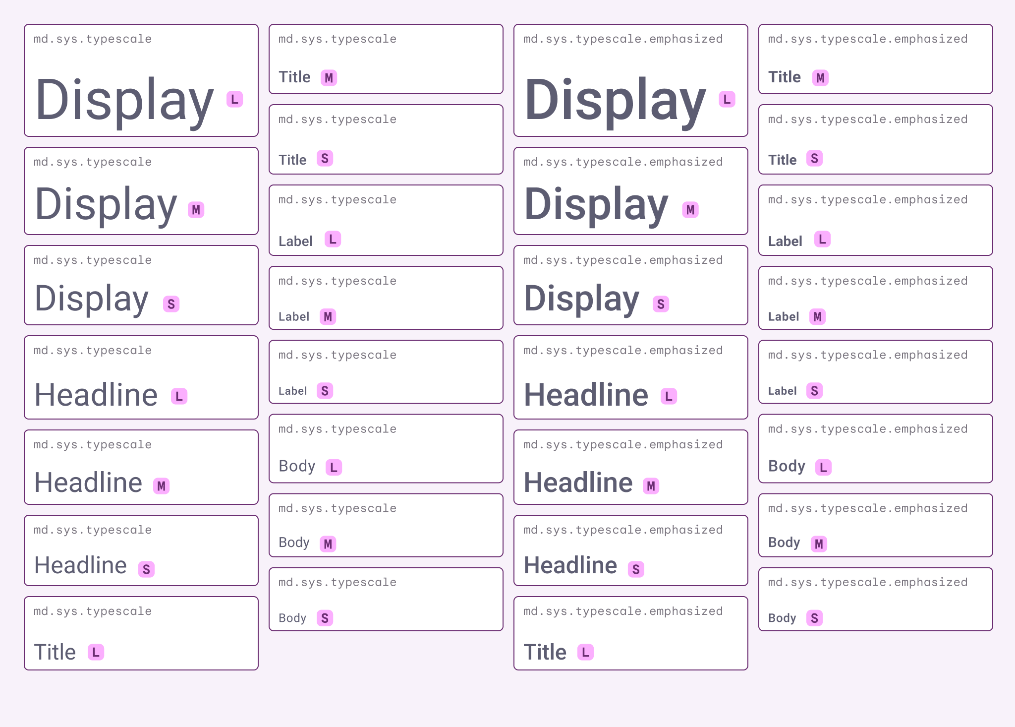
Typography tokens define the text hierarchy of the product. These often include styles such as headings, body text, captions, and code or monospace styles. Each token typically specifies size, weight, and line height.
Spacing scale
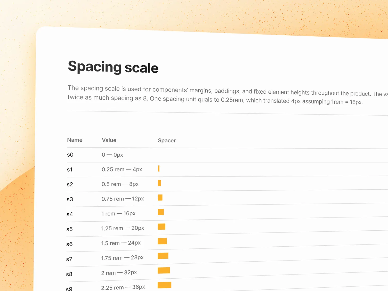
A spacing scale establishes consistent layout spacing across the product. Many systems define a base unit and scale spacing values in multiples of that unit. These values are then reused for padding, margins, and layout gaps.
Component library
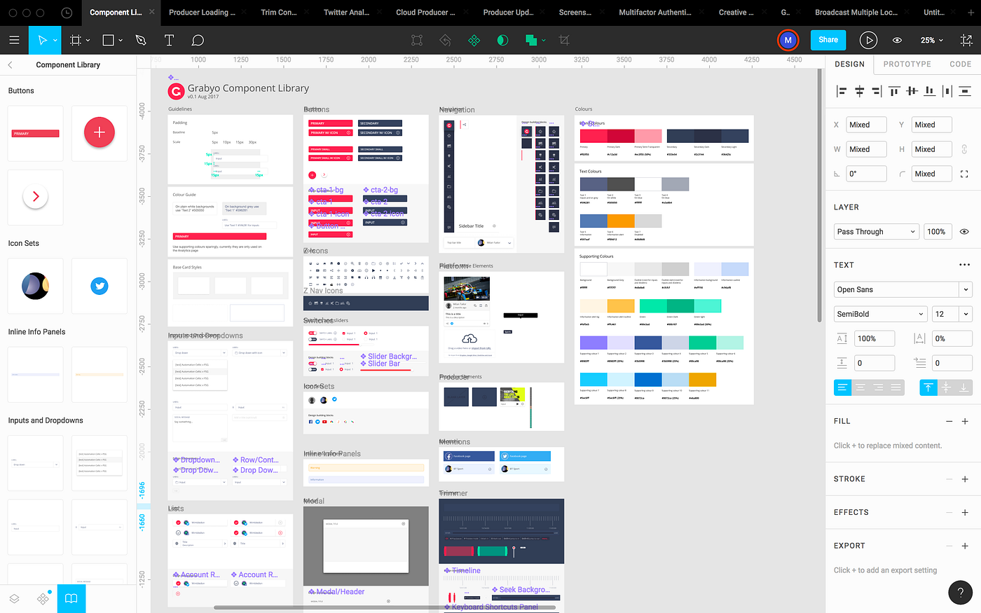
Reusable components capture common UI patterns such as buttons, inputs, cards, modals, alerts, and badges. Each component typically defines its variants, interaction states, and token usage.
Radius and elevation tokens — Many systems also define consistent values for border radius and shadows or elevation levels. These tokens help maintain consistent visual depth and shape across the interface.
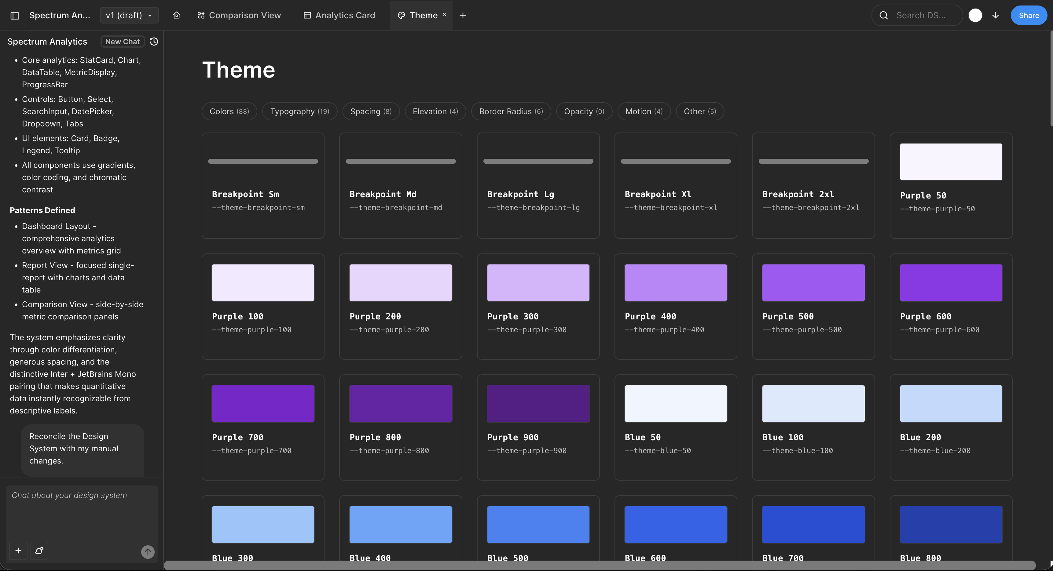
Importing your system into Moonchild
Design systems can be exported from design tools in structured formats such as:
- Figma variables
- Design token JSON files
- Component specifications
Moonchild can ingest this information so that the system becomes the reference for future interface generation.
Generating screens within system constraints
Once a system is defined, it can guide how new screens are produced.
For example, when generating a new flow, the process can reference:
- Existing components from the design system
- Tokens for colors and typography
- Spacing values from the defined scale
Using these references helps generated screens align with the design language already used in the product.
Rather than inventing entirely new patterns, the generation process can compose screens from the building blocks defined in the system.
Evolving the system over time
Design systems are rarely complete from the start. As teams build new features, they often discover patterns that were not previously defined.
AI-assisted workflows can make these gaps more visible.
For example:
- A new layout pattern may appear repeatedly across generated screens
- A missing component may become obvious when building new flows
Teams can incorporate these patterns into the design system, expanding it over time.
As the system grows, it becomes a more comprehensive foundation for both manual design work and AI-assisted generation.
FAQ
What if we don't have a design system yet?
If your product already contains many screens with consistent patterns, those patterns can often be organized into a formal system. Tools like Moonchild can help analyze existing screens and structure them into tokens and components.
Can teams maintain multiple design systems?
Yes. Organizations often maintain separate systems for different products or product lines.
What if the system is incomplete?
Teams can begin with foundational tokens such as colors, typography, and spacing. Additional components and patterns can be added as the system evolves.
Can the system be updated over time?
Design systems are typically living artifacts. As new patterns emerge, tokens and components can be refined or expanded.
Written by
Nicolas CerveauxFounding Design Engineer at Moonchild AI. Bridging design systems and engineering to build the future of AI-native product design.
Related Articles
8 Best Rapid Prototyping Tools for Product Teams in 2026
A guide to the 8 best rapid prototyping tools for modern product teams, from AI-first platforms to high-fidelity interaction tools.
AI Design Systems: The Complete Guide for Product Teams
Discover why design systems are inseparable from AI generation. Learn the four maturity levels of design systems and how to build one that works with AI tools to eliminate manual cleanup.
AI in Product Design: The Definitive Guide for Product Teams
Move beyond the hype. Learn the honest state of AI in product design, the five-stage maturity model, and how roles change when teams adopt AI design tools.