Design Systems for AI UI: How to Build the Foundation First
Before using AI to generate large numbers of UI screens, teams benefit from establishing a design system that defines their visual language, brand constraints, and reusable components.
A design system provides structured guidance for colors, typography, spacing, and interface patterns. When these elements are clearly defined, they can guide both manual design work and AI-assisted workflows.
Moonchild is designed to work with this type of system-first approach. Instead of generating screens without context, teams can provide their tokens, components, and design patterns as inputs that guide the generation process.
Why the system comes first
Consider two common workflows.
Workflow A: Generation without a system
Teams generate UI screens before defining a shared design system. Because there are no formal tokens or components guiding the output, the generated screens may include variations in button styles, color usage, typography sizes, and spacing values. The team then spends time reviewing screens and aligning them with existing design patterns.
Workflow B: System-first generation
Teams define or extract a design system first. This system includes tokens, components, and usage patterns. When screens are generated within that framework, the output can reference the same design tokens and component patterns used throughout the product. In this workflow, the design system acts as the shared foundation for both designers and AI-assisted tools.
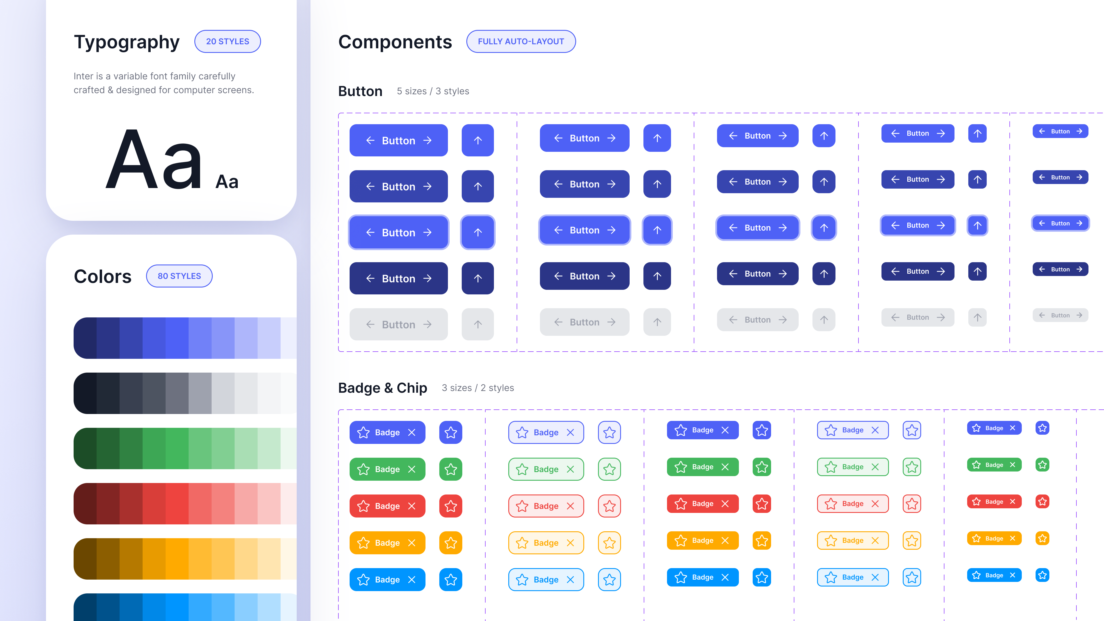
The minimal design system
A system used for AI-assisted generation does not need to be extremely large. Many teams start with a small set of foundational elements.
| System Element | What It Includes |
|---|---|
| Color tokens | Core palettes and semantic usage categories |
| Typography tokens | Type scale, font families, weights, and line heights |
| Spacing scale | A consistent set of spacing values used across layouts |
| Core components | Reusable UI elements such as buttons, inputs, cards, and modals |
| Accessibility guidelines | Contrast considerations, focus states, and interaction targets |
These elements form the basic structure that supports consistent interface design.
Core system elements explained
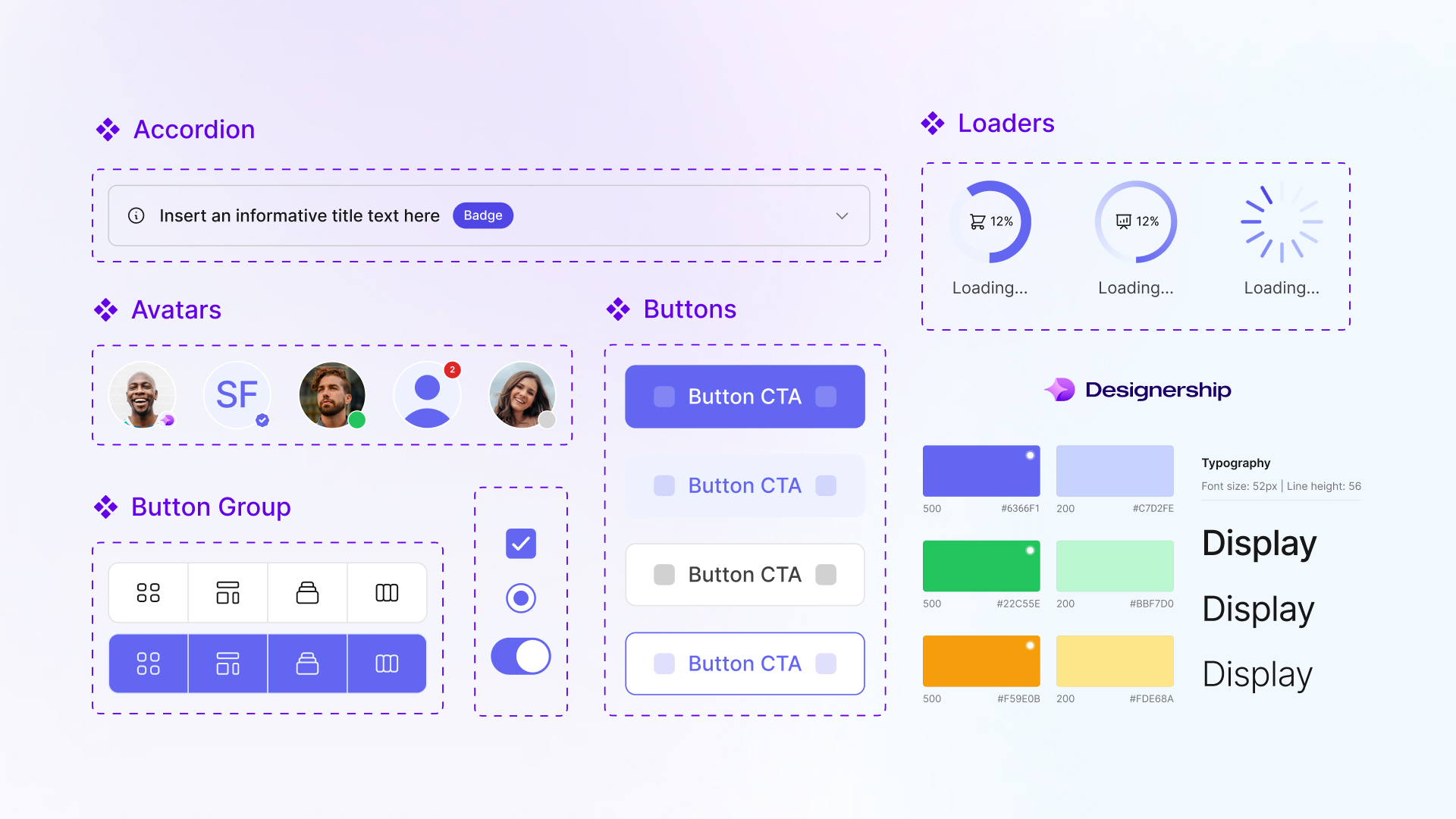
Color tokens
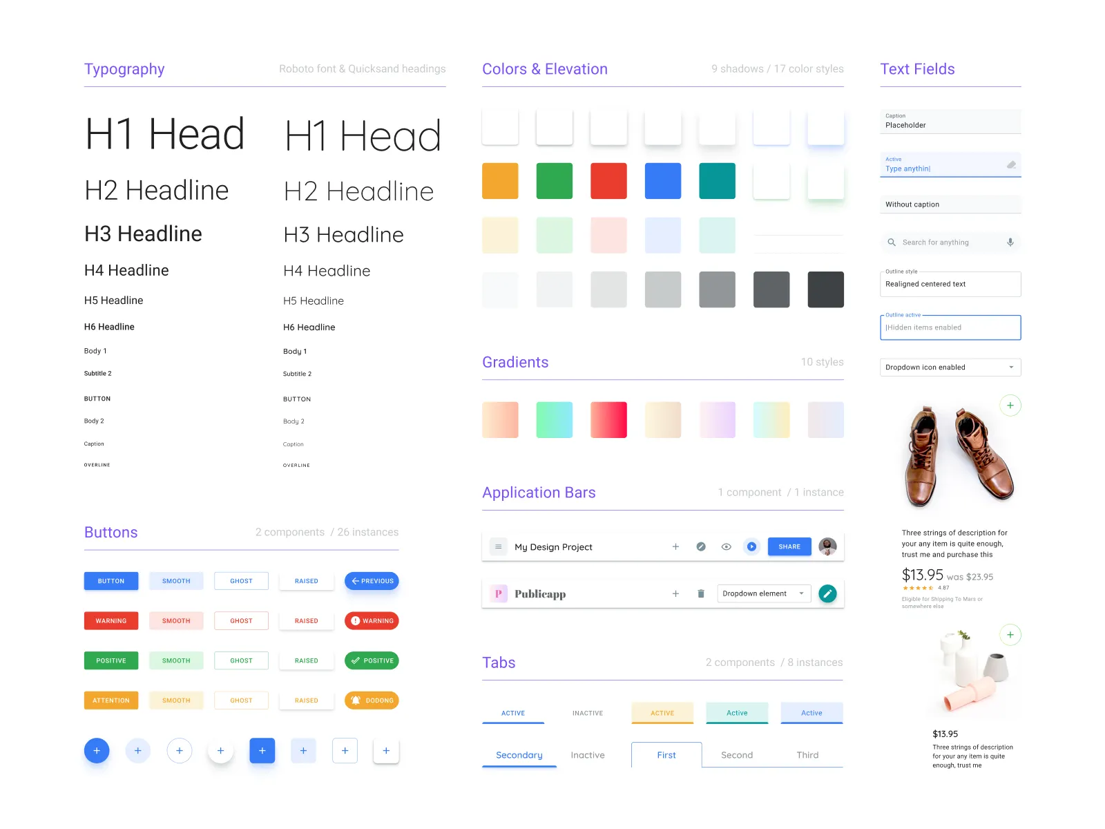
Color tokens organize color usage into structured categories rather than isolated values. Typical categories may include primary brand colors, neutral colors for text and backgrounds, and status colors such as success, warning, and error. Using tokens helps maintain consistency across both design and development.
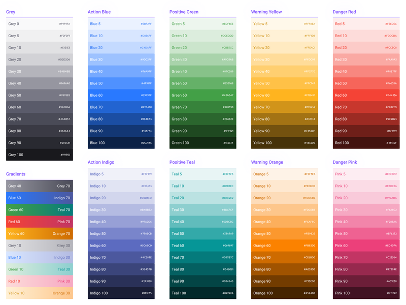
Typography tokens
Typography tokens define the hierarchy of text styles used throughout the product. Examples often include headings, body text, captions, and monospace styles for code or data. Each token typically specifies properties such as size, weight, and line height.
Spacing scale
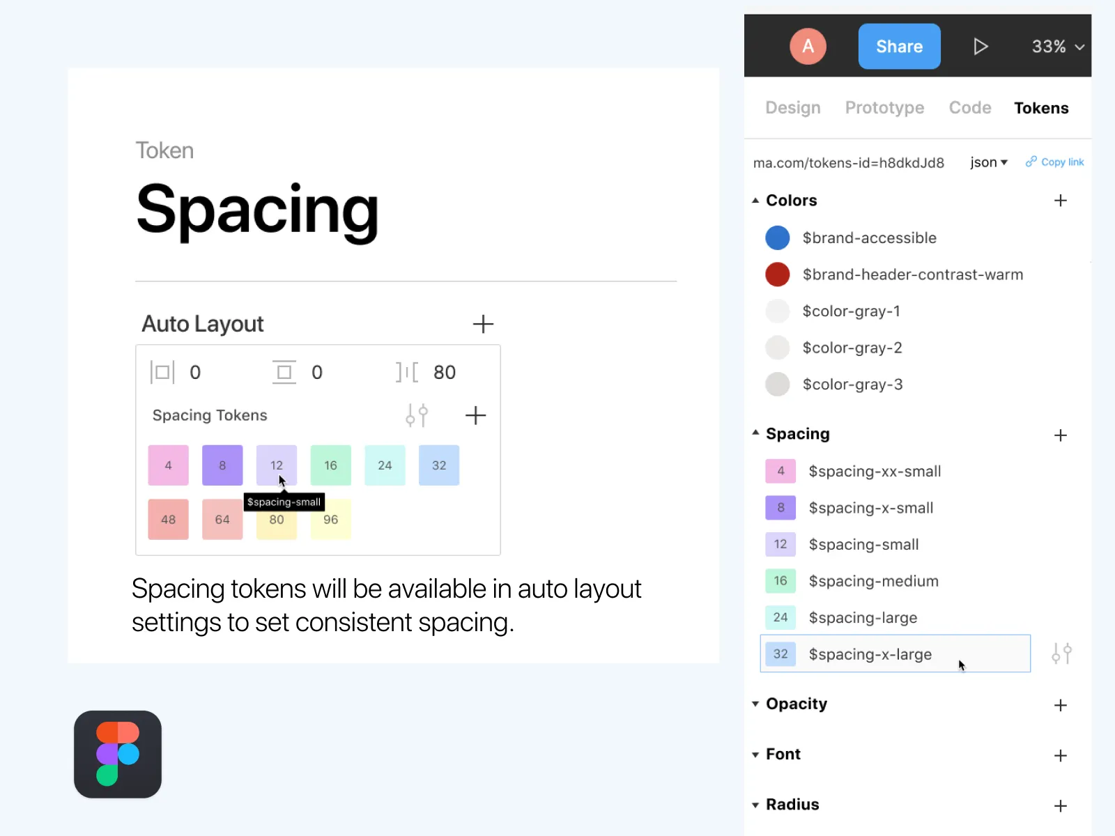
Spacing tokens provide a consistent set of layout values used for padding, margins, and gaps. Many design systems define a base unit and scale spacing values from that base. This ensures visual rhythm and alignment across screens.
Component library
Reusable components represent common interface patterns. Examples include buttons, inputs, cards, navigation elements, modals or dialogs, and badges and alerts. Defining these components ensures that recurring patterns remain consistent across the product.
Accessibility considerations
Design systems often include accessibility guidance, such as minimum color contrast targets, visible focus states for interactive elements, and adequate interaction areas for touch interfaces. Including these considerations helps teams design interfaces that are usable across different contexts and devices.
Building or generating the system
Teams typically establish a design system in one of several ways.
| Approach | Description | Typical scenario |
|---|---|---|
| Manual system design | Designers define tokens and components from scratch | Teams with established design system practices |
| System extraction | Existing screens are analyzed to identify reusable patterns | Products with many screens but no formal system |
| Hybrid approach | Generated or extracted systems are refined by the team | Teams formalizing an evolving product |
Moonchild can support system extraction by analyzing existing screens and organizing recurring patterns into tokens and components. Teams can then refine those outputs to match their design standards.
Preparing your team for system-first workflows
Before introducing AI-assisted screen generation, teams often establish a few shared practices.
1. Align on system usage — Agree that new screens should reference the system's tokens and components rather than introducing ad-hoc styles.
2. Document system structure — Ensure that designers and developers can access documentation describing tokens, components, and usage guidelines.
3. Integrate system tooling — Design systems are often integrated into tools such as Figma component libraries, design token files used in development workflows, and documentation platforms.
4. Establish governance — Teams typically define processes for adding new tokens or components, reviewing changes to the system, and communicating updates to the broader team.
A system-first workflow
A typical workflow for system-guided generation may look like this:
1. Establish the system — Define tokens, components, and patterns that represent the product's visual language.
2. Validate coverage — Ensure the system supports the most common interface patterns used in the product.
3. Generate new screens — Use tools such as Moonchild to generate or prototype screens that reference the system's tokens and components.
4. Evolve the system — As new interface patterns emerge, update the system so future designs can reuse them.
Over time, the system becomes the foundation for both manual design and AI-assisted interface generation.
FAQ
How detailed does the system need to be before starting generation?
Many teams begin with foundational elements such as colors, typography, spacing, and a small set of core components. Additional components can be added as the system evolves.
What if our system is incomplete?
Most design systems grow over time. Teams can begin with the elements they have and expand the system as new interface patterns emerge.
Can the system change after generation starts?
Yes. Design systems typically evolve as products grow. Updates may include adding new tokens, refining components, or documenting new usage patterns.
How can teams maintain system consistency?
Consistency is typically supported through a combination of component libraries, design tokens, documentation, and design review practices.
Does the system need to live in Figma?
Many teams maintain their design systems in Figma because it supports component libraries and design tokens. However, systems can also exist in other formats depending on the team's workflow.
Written by
Nicolas CerveauxFounding Design Engineer at Moonchild AI. Bridging design systems and engineering to build the future of AI-native product design.
Related Articles
8 Best Rapid Prototyping Tools for Product Teams in 2026
A guide to the 8 best rapid prototyping tools for modern product teams, from AI-first platforms to high-fidelity interaction tools.
AI Design Systems: The Complete Guide for Product Teams
Discover why design systems are inseparable from AI generation. Learn the four maturity levels of design systems and how to build one that works with AI tools to eliminate manual cleanup.
AI in Product Design: The Definitive Guide for Product Teams
Move beyond the hype. Learn the honest state of AI in product design, the five-stage maturity model, and how roles change when teams adopt AI design tools.